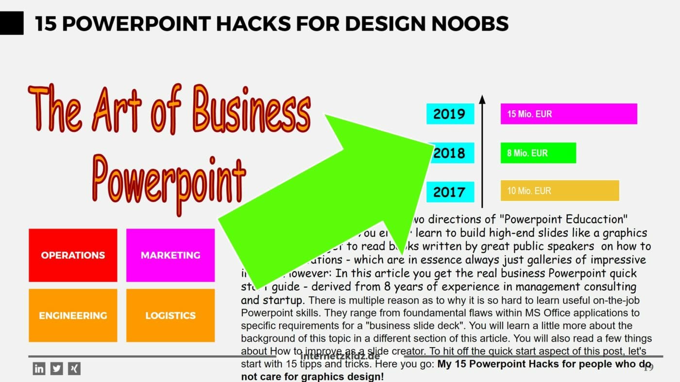
In my experience there is only two directions of “Powerpoint Educaction” content in this world. You either learn to build high-end slides like a graphics designer or you get to read books written by great public speakers on how to build presentations – which are in essence always just galleries of impressive images. However: In this article you get the real business Powerpoint quick start guide – derived from 8 years of experience in management consulting and startup.
There is multiple reason as to why it is so hard to learn useful on-the-job Powerpoint skills. They range from foundamental flaws within MS Office applications to specific requirements for a “business slide deck”. You will learn a little more about the background of this topic in a different section of this article. You will also read a few things about How to improve as a slide creator.
To hit off the quick start aspect of this post, let’s start with 15 tipps and tricks. Here you go: My 15 Powerpoint Hacks for people who do not care for graphics design!
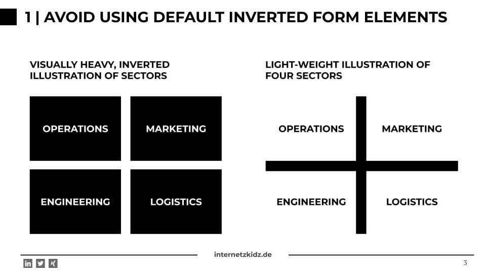
1 | Avoid using default inverted form elements
Configuring a strong primary color in the Powerpoint main color pallette (blue, dark red, green e.g.) usually leads to an annoying problem: whenever you create a new form on a slide it usually comes with this primary color’s background forcing you to the change the font color to white (inverting). Although this appears natural to most of us by now, it is not good visual practice. Besides being a total waste of time (changing the font color manually), it is also a total waste of space. Two of these default square forms and the slide is visually packed. It leads to important elements missing whitespace and “room for breathing” in your reader’s eye.
Try using different elements for separating areas and topics from each other instead. You can establish hierarchical relationships by using bold font, font sizes or smaller connecting form elements or borders. As is illustrated in the example below.
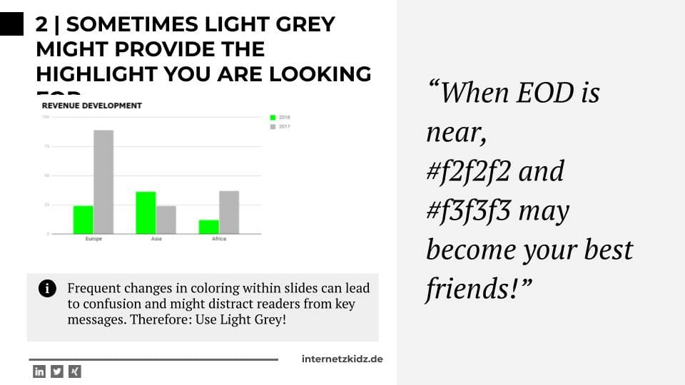
2 | Sometimes Light Grey might be the highlight are looking for
In connection to tipp #1 I would also like to recommend using the background colors #f2f2f2 and #f3f3f3. They are both variations of light grey which can create a visual separation within a slide without instantly dividing it into different content continents. When establishing two different areas on slide you can do so by using a light grey background in one part while keeping the other part grounded in white.
Info-texts (below graphs e.g.) are also a great use case for this type of highlighting because it will not draw to much attention away from your “numbers” while still stressing there is additional information available.
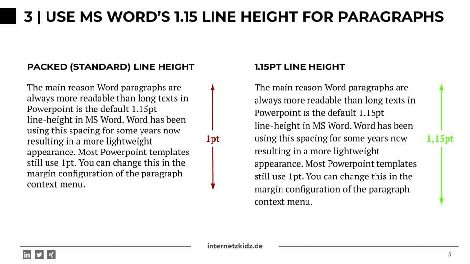
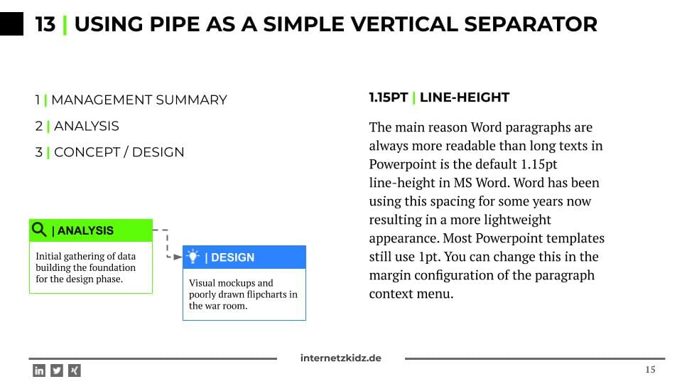
3 | Use Microsoft Word’s 1.15 Line Height for Paragraphs
Do not use full-width, full-height text paragraphs on a powerpoint slide! Period! That is a practice exclusively reserved to professors. However: I am aware that this is sometimes also required for the use case of documentation powerpoints (presentations that will never actually be presented).
The main reason large paragraphs of text usually look very good in Word-documents and look like sh*t on a Powerpoint slide , is the 1.15pt line-height formatting. In MS Word the 1.15pt has been the default line spacing for years while most Powerpoint templates use the 1pt by default. The bigger line-height gives text more space to work with and makes a slide look less crowded. You can change this in the margin configuration of the paragraph context menu.
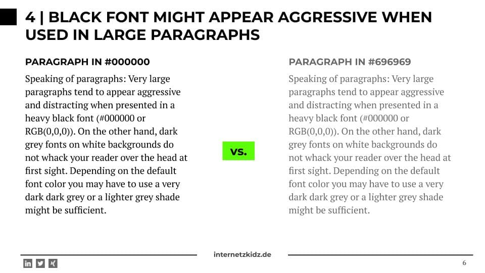
4 | Black font might appear aggressive when used in large paragraphs
While we are on the topic of long paragraphs: They might appear a little aggressive and/or distracting when presented in a heavy black font (#000000 or #111111 e.g.). On the other hand, dark grey fonts on white backgrounds do not whack your reader over the head at first sight. Depending on the default font color you may have to use a very dark dark grey or a lighter grey shade might be sufficient.
5 | Use web icons – even in Powerpoint
Four or five years ago icons conquered the web. Nowadays it is hard to find a company website (mostly B2B) that does not list its core competences in an icon-grid. Users or designers seem to prefer this to simple text or bullet points.
I recommend making good use of this phenomenon in your slide decks. You have boring list but a catchy headline? Use an icon! You need to separate two sections on one slide? Use an icon! You have 4 phases to your project? Use 4 icons!
If your company slide master does not contain an icon library there is two DIY options:
- Install Font Awesome as a normal system font on your windows PC insert the icons as characters / symbols into your presentation. This practice comes with the additional bonus of letting you change the icons color as normal font color. Limiting factors for this solution might be missing admin rights to install fonts on your company notebook or compatbility issues across devices with embedded fonts.
- The Noun Project is also a very useful icon library. Here you can modify the icons size and color via web interface and afterwards download the icon as an image.
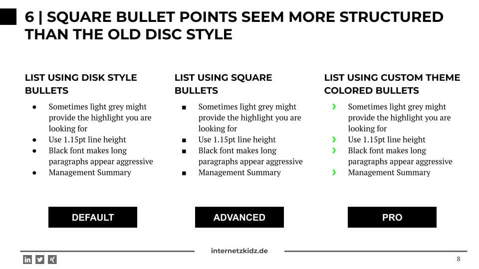
6 | Square bullet points seem more structured than the old disc style
In a presentation where you used your OCD super powers to keep every form a square or at least a rectangle it is dissatisfying seeing rounded bullet points! In most Powerpoint templates I have seen over the last years the disc bullet point is the default value for list elements. Changing this default setting might forever improve the look of your presentations.
*This move does not come without risks: After your work is done, you might get a call from the boss of the slide master and get a 30 minute lecture on why square bullet points are outside the CD.
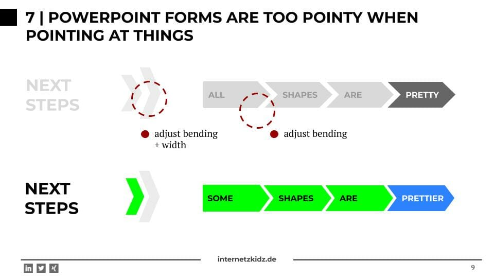
7 | Powerpoint forms are too pointy when pointing at things!
Arrow forms in Powerpoint are the main reason to live for project managers and task pushers. These forms show dynamics and progess (where is none)! Unfortunately the use of these forms constantly mess up the looks of slides because Microsoft makes them too pointy on default. You need to use the yellow dots on an arrow form and adjust its bending as well as its width to fix this default issue. You may note it looks better afterwards – without losing any of it’s dynamic appeal.
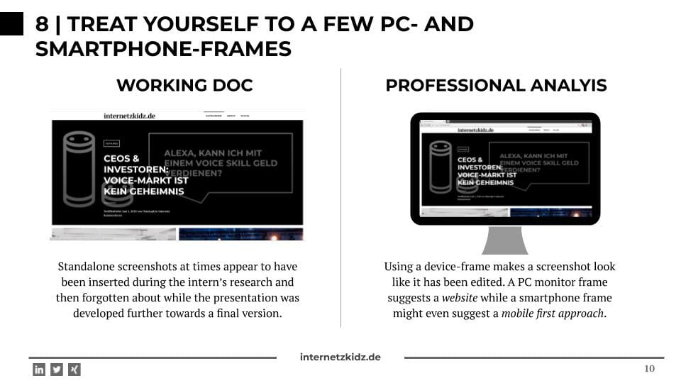
8 | Treat yourself to a few PC and smartphone frames
When shopping for icons after reading tipp #5 you may want to chip in on a few smartphone-, tablet- and desktop-frames for your screenshots. Nowadays screenshots of websites are an essential part of every digitally relevant presentation. To ensure they do not look like screenshots of MS Word and your reader recognizes them instantly you want to put them in a frame.
I cannot stress enough how hard it is to write the next paragraph: Eventhough I am a passionate Windows- and Android-user I have to admit frames being modelled after iPhone or iMac devices usually make a better first impression!
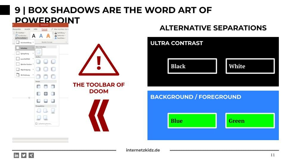
9 | Box shadows are the Word Art of Powerpoint
A couple of years ago some genious developers and designers decided the web and desktop applications need depth and came up with box shadow styling effects for forms. My eyes still did not recover from this invention. The web development community showed some integrity and removed these elements from their creations shortly afterwards. However Microsoft remains reluctant in the matter: Every slide creator still has an almost unlimited amount of shadow options at his disposale and some of the effects are even added by default when adding new forms to a slide.
I urge you to keep these effects out of your decks for good. The web has established itself as being a “flat design” environment and I am grateful for every new presentation that follows this example. If you still need separating effects for some slide elements try using white borders on dark backgrounds.
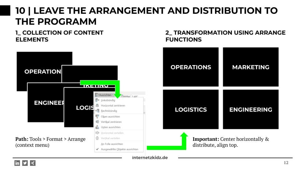
10 | Leave the arrangement and distribution to the program
While working in Hamburg a couple of years back I had an interesting conversation with a graphics designer. He told me that he spends 40% of his time creating elements / visuals and 60% arranging them. Slidely confused I replied: “But arranging is the easy part. You just go click, click, click and you are done!” Boy, was I wrong. But that is something I only later realized building the first C-Level presentations.
Lucky for me Powerpoint has build-in functionalities like distribute vertically or arrange horizontally. Once a presentatoin is complete, go over every slide using these functions and I guarantee the presentation will improve by another 5%.
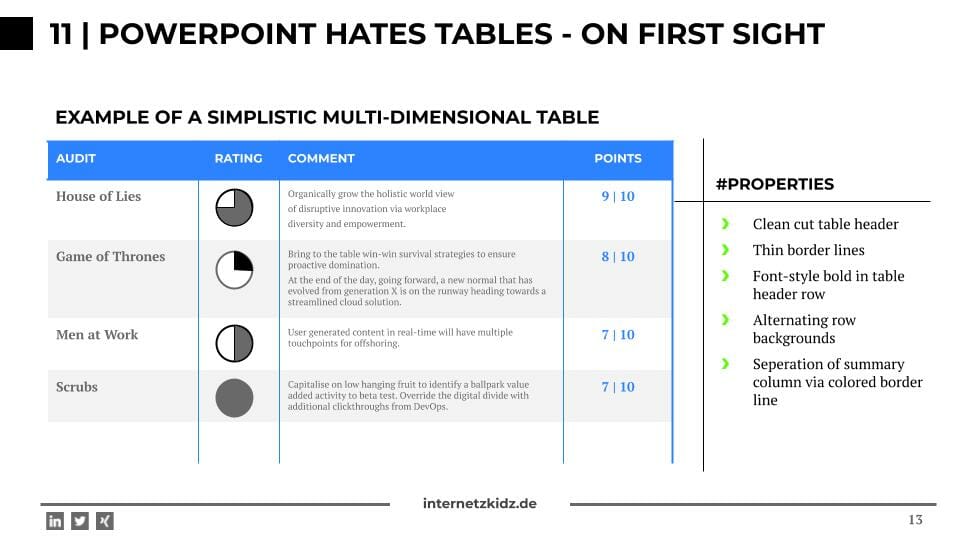
11 | Powerpoint hates tables – on first sight
One of the major default-design-horros in the Microsoft world relate to tables. In my opinion all pre-built table formatting options are crap! They range from bad to worse and appear to follow a design principle I like to call “fat and colorful”.
To avoid table-format-raging I would like to list my favorite table format attributes:
- Well seperated table headline row: The headline font is the same size as the body font, but background, font-weight or text-case may differ.
- Lightweight and bright borders (often times grey)
- Limit bold font-weight to first row and maybe last / total row and column
- Alternating row backgrounds to decrease use of table borders in body
- Increase border weight for headline and total row
- Spacing within table cells so text / content does not touch cell borders
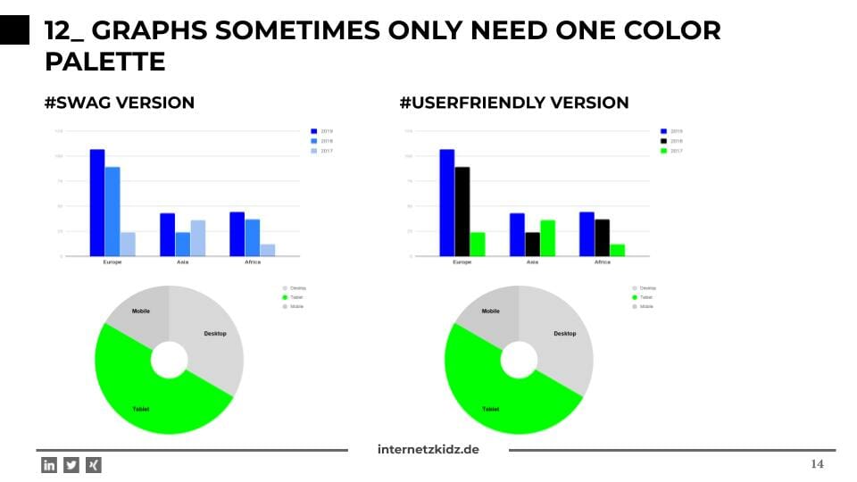
12 | Graphs sometimes only need one color pallette
When building graphs the choice of bar colors always impacts the user’s experience when consuming the data. A lot of different color improves the readability in terms of assigning categories and grouping bars, but it also makes your slide look like it was build by second grader. For presentation presentations (I also explained there are also non-presentation presentations) I like to use colors within the same color pallette. This means that I used normal blue, dark blue, light blue, extra dark blue etc. for coloring a 4 to 5 category graph. In office these colors are always listed in one column when using the color picker menu.
Sometimes it is also helpful to ease the color transition for categories who are close-relatives (the year 2018 and 2017 e.g.), Sometimes it also helpful to pre-focus the one category that is actually relevant to presentation while coloring the rest in differnt colors of the grey spectrum.
13 | Using Pipe as a simple vertical separator
To seperate text within a single line you can use periods, commas, underscores etc. The most elegant of all – in my opinion – is the pipe: |
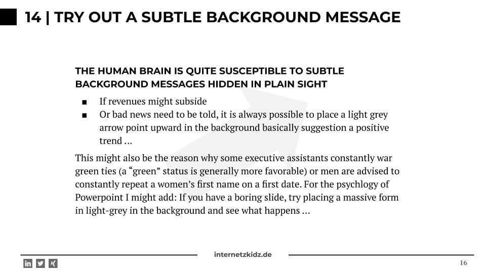
14 | Try out a subtle background message
The human brain is quite susceptible to subtle background messages hidden in plain sight. This might also be the reason why some executive assistants constantly war green ties (a “green” status is generally more favorable) or men are advised to constantly repeat a women’s first name on a first date. For the psychlogy of Powerpoint I might add: If you have a boring slide, try placing a massive form in light-grey in the background and see what happens …
If revenues might subside or bad news need to be told, it is always possible to place a light grey arrow point upward in the background basically suggestion a positive trend.
15 | Arial Narrow is a PPT-Hacker’s best friend
Around 80% of corporate slide masters use Arial as a default body font (no quantitative research was invested in this hypothesis). For the best amongst us Powerpoint hackers this is usually an invite to cheat on the slide design. If you ever run into trouble relating to insufficent text space or problematic line breaks, just change the font from Arial to Arial Narrow. Magic!
Disclaimer: This workaround usually only passes the first-sight-test. This means: If the overall contents of the slide was great and correct, noone will care. If the slide sucks, you better make a run for it!
Not enough space left in ppt-form: Switch from Arial to Arial Narrow – nobody notices …

Deep Dive: This is why so many slides look really bad
When I started building big slide decks in my first mangement consulting job in 2012 I was faced with another challenge my three years of business school did not prepare me for. I had two problems at once:
- Sometimes I had to build slide decks containing around 100 individual slides.
- Every slide I built was looking significantly worse than everything my colleagues were creating (for example the version 1 of the deck I was currently working on)
The nerd I am I decided to tackle the problems by buying and reading a book on the topic – a practice that had served me well before. My search for books like “create amazing business slides in 10 minutes” was not successful. Every author dealing with presentation creation was mainly adressing big CEOs and speakers who had their next keynote coming up. None of them was adressing the management consulting slide factory issues. The books contents did not help me for three reasons:
- In a business presentation context a lot of presentations are never truly presented. They merely serve as documentation and a lot of them are doomed to be stored in the manager’s drawer after a project is finished.
- Due to the documentation purpose of the presentation oftentimes you are forced into using elements that you would not use on a keynote-stage. Long text paragraphs giving in-depth info, complex graphs, project plans (Visio or ThinkCell) and so on.
- Powerpoint is not build for visually pleasing presentations. There – I said it. This does not mean you cannot build good-looking presentations using the software, but it means you have to tweak a lot of default options and settings to do so.
Keep learning: This is how you improve your slide quality
As mentioned before there is no real e-learning environment for “Business Powerpoint”. Most books d not help, blogs and e-learning tutorials focus on more interesting topics. I made my biggest leap forward in regards to slide quality when I discovered the platform slideshare. slideshare is presentation hosting platform (like a presentation youtube) that was bought by LinkedIn a few years ago. Amongst all the presentations on the platform the ones being uploaded by McKinsey and BCG were the most helpful in terms of business slide development. McKinsey consistently uploads high-end presentations that are full of new elements and information compositions. BCG on the other hand is a good example of how you can built visually appealing presentation while using a pretty simple and limited slide master to begin with.
I would like to close this listical by recommending two presentations to get your learning started:
A BCG consultants love life
Dear NSA, let me take care of your slides
Your feedback: What helped your slide quality?
Leave a comment in case you have any suggestions as to what could also be considered a Powerpoint Hack for Design Noobs!

[…] If you were still looking forward to Powerpoint slides, I can quickly recommend my article: 15 Powerpoint Hacks for Design Noobs. […]
[…] the way: While browsing through the templates I saw that my Powerpoint design tips for Noobs were not bad at all. Many principles can be found in these slides as […]