Google changed the Google Ads Interface – again. This is how you return to the old interface.
If you recently logged into Google Ads and muttered “What the hell!” to yourself, you’re not alone. Google has relaunched the Google Ads interface. Instead of the black left sidebar and the slightly lighter main content area, you can now expect different schades of gray and a much reduced navigation. This might turn out to be bad news for experts who could otherwise dive into the deepest campaign configurations while half asleep.
This is how you return to the old Google Ads interface
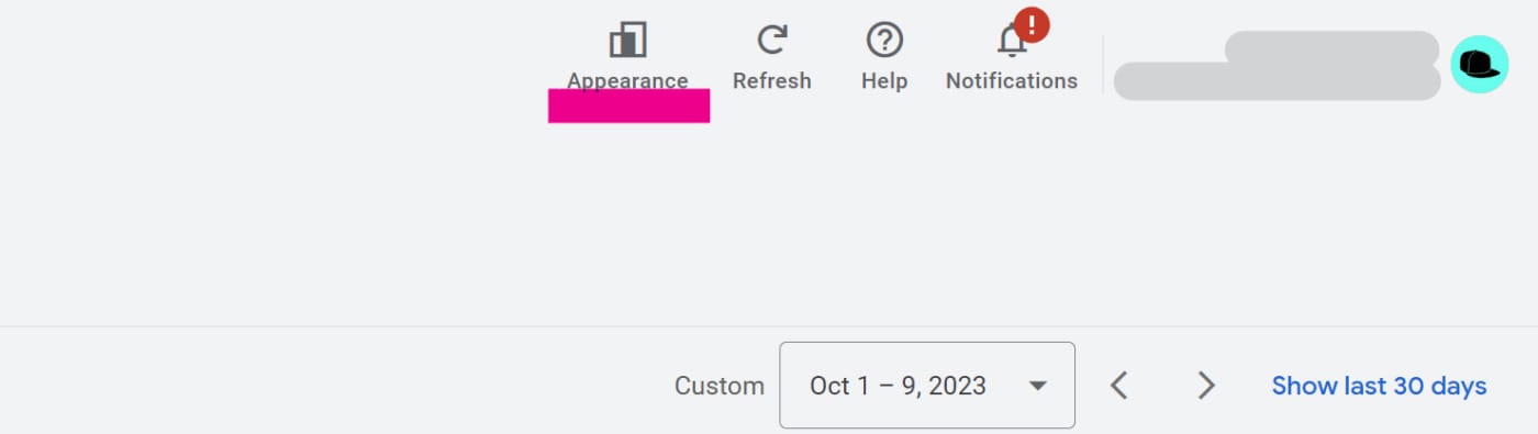
1 | Apperearance / Design Menu
Click the Appearance Menu in the Top-(Right-) navigation in the new interface. A dropdown will appear.
2 | Pick the previous design
In the dropdown you will find three main menu items. Select Use previous design.
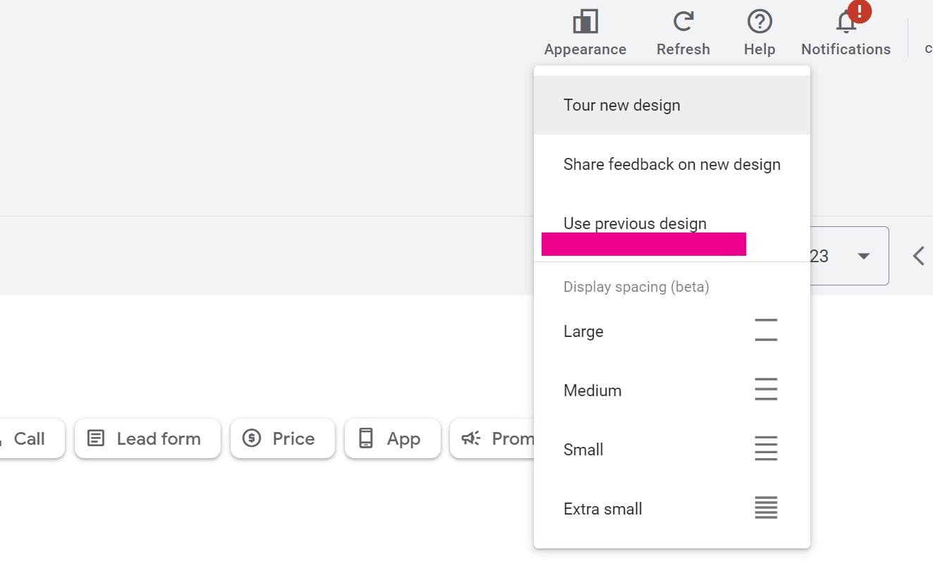
After that you should be able to work productively in the old design again.
Furthermore you will find the following options in the menu
- Tour the new design
- Share feedback on new design
There is also a beta in the menu that lets you choose your spacing in the Google Ads interface. Super important!
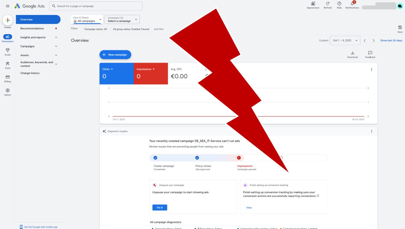
The new Google Ads interface
After you log in the new Google Ads interface it will await you looking something like this:
Noticeable differences in the new interface compared to previous one include:
- The entire interface has become brighter (light gray).
- This is mostly due to the fact that the black campaign and campaign type navigation areas have disappeared
- The left navigation is significantly reduced
- Some of the sections (Conversions, Admin, etc.) from the Tools navigation at the top right, have moved to the left navigation.
- Campaign settings links are now above the campaign and ad group lists in the center of the page.
- The report editor and other report features have moved to the secondary navigation on the left.
- Campaign settings (just like ad group settings) open in an overlay that “flies in” from the right.
- The Assets section (very prominent in Performance Max campaigns) is very prominently placed in the new navigation.
- Saved views have moved from the top navigation to the main content area above the tables.
All in all, the facelift feels like a push towards the Performance Max era. Many of the more prominent features indicate functions that are used especially in Performance Max campaigns. Furthermore, the reduction of the menus is also a step towards the new campaign type, as the configuration options of the new PMax campaigns are similarly reduced.
